Allocating Scarce Resources: TTRPG Edition

My favorite games convention has been going through some growing pains over the last couple of weeks. It’s a tabletop roleplaying game convention, which presents an interesting resource allocation problem: You have some big number of participants N, and a collection of games and events, each of which can take some number of participants ranging from 3 to 50.

Little Red Riding Hood filling out a ballot in a drab school gymnasium turned into a polling place. Little Red Riding Hood filling out a ballot in a drab school gymnasium turned into a polling place. Highly detailed, cinematic lighting, in the style of Norman Rockwell and Takashi Murakami. (OpenJourney v4)
Little Red Riding Hood fills out a ranked-choice ballot.

To date, the convention uses a First-Come-First-Served (FCFS) strategy for allocating players to games. Signups open at a specific time, and everyone hits refresh on the website feverishly, trying to get into a few very high-popularity games, and then branching out to other interesting-looking games once the super-popular games are filled.

The FCFS strategy has a couple big problems: Most visibly, the servers have a tendency to melt down when everyone shows up in the first minute after signups open, clicking around looking for their favorite game which hasn’t filled up in the first milliseconds. Less visibly, folks who can’t be available during the moment sign-ups open may miss out on many of their preferred games.

So FCFS gives us both a technical problem (a fixed deadline causing computer meltdowns), and a fairness problem. The same problem occurs pretty much anytime someone tries to solve a resource-allocation problem online with FCFS. (Notably, it’s impossible to get a camp site in California without either writing a bot or paying a third-party who wrote a bot.)

A Better World is Possible

To fix both problems, we need to a) give people a way to express their preferences asynchronously, and b) design an allocation algorithm to assign people to games given their preferences.

Here’s a proposal for how to do it.

First, we allow people to submit their ranked preferences anytime before a fixed deadline. This gives everyone plenty of time to peruse the available games, move things around in their preference list, etc.

The allocation algorithm: Once the deadline passes, we look at all of the ranked preferences and pair people with games. One way to do this is to randomly order everyone, and then go through the list and sign people up for their top-ranked game which isn’t already full. Then go through the list again, assigning people to their top choices which aren’t already full, or conflicting with things they are already signed up for. Repeat as many times as you like. This allocation algorithm is pretty trivial to write, and should run in at most a few seconds.

After the initial allocation is run, one can let things settle for a while, and then run the allocation again after giving people time to adjust preferences. And finally, open FCFS signups to help fill any remaining slots with little friction.

This is fair, in the sense that everyone has the same chance to be at the top of the random list, and furthermore everyone gets their top-available choice before anyone gets assigned to a second game.

This also removes most of the pressure on the server: People submit their preferences at random times before the deadline. You will still get some ‘crunch’ near the deadline, but likely nothing like what is seen with FCFS. And if the deadline needs to be extended, it’s no problem – at worst, people have a bit more time to submit their preferences before the allocation algorithm is run, which isn’t a problem at all. The allocation algorithm works the same whenever you get around to running it.

I think the hardest part of this proposal is likely the UX for collecting people’s ranked preferences and letting them re-order them. I imagine each game description page having a ‘heart’ button. Then each user has can go to a page where they can order the ‘heart’ed games, probably with the game title, date+time, game host, and perhaps a small user-editable notes field (if we’re feeling fancy).

A Small Amount of Further Analysis

The proposed method mixes a lottery with ranked-choice voting.

Lotteries are a well-loved method for fairly distributing scarce resources: Let everyone who is interested sign up, and then distribute the resources randomly. Weighted lotteries have been proposed for situations where uniform-randomness isn’t desired. One could use weightings to give certain preferred groups a higher chance of getting an early allocation (First time attendees? Registered game masters?), though I expect it’s more trouble than it’s worth.

Ranked-choice voting progressively eliminates candidates, using each person’s current-top-preference as their vote in each round. (When it comes to elections, I have a strong preference for approval voting, due to issues with randomness in the elimination order leading to strange outcomes in the usual ranked-choice scheme, and thus encouraging convoluted strategic voting strategies. However, I don’t think this is a problem in the games convention context.)

Finally, it’s possible to make the system deterministic, replicable, and auditable by using a seeded random number generator to produce the random ordering of the participants. (Some care may be needed to avoid gaming the system if the seed is publicly known before the allocation algorithm is run.)

Animating Stable Diffusion Embeddings

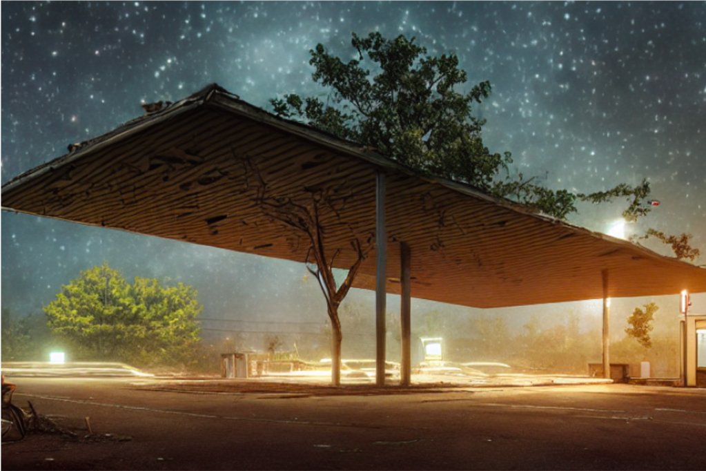
Stable Diffusion is the best neural text-to-image engine you can run on your own hardware. I recently picked up a new 3090 for my home machine, and spent a couple weekends messing around with Stable Diffusion. Initially, I’ve been using it to generate concept art for a game of Apocalypse World, a tabletop roleplaying game. Stable Diffusion really shines in this space; the creation of the concept art becomes a bit of a collaborative dance, as I find new ideas in the ML output that might get incorporated into the game. The rich imagery also helps create a shared universe for the players, not too unlike the incredibly rich art that TTRPG books tend to invest in. And the small scale of a single TTRPG game, with just a few players, means that we can add concept art to a place where it never would have existed before. These kinds of ML tools are fantastic for lowest-rent collaborative creative exercises.

An abandoned gas station, generated with Stable Diffusion.

Having full access to the model + execution code makes it really straightforward to get into the guts and start tinkering with non-standard use cases. I was particularly interested in mucking around with the various latent/hidden representations used by the model. In this post, I’ll a) explain the parts of the model (briefly), then explain how I b) used the text embedding latents to create some simple animations and c) to sample lots of minor variations of an image.

An animation transitioning between five different text prompt embeddings (and back again).

Model overview

To get started, it’s quite easy to copy the ‘Writing your own inference pipeline‘ section of the Stable Diffusion docs on HuggingFace. Copy out the process, and then check that the code actually runs and produces images.

To start mucking around with the latents, it helps to have a good understanding of the model structure.

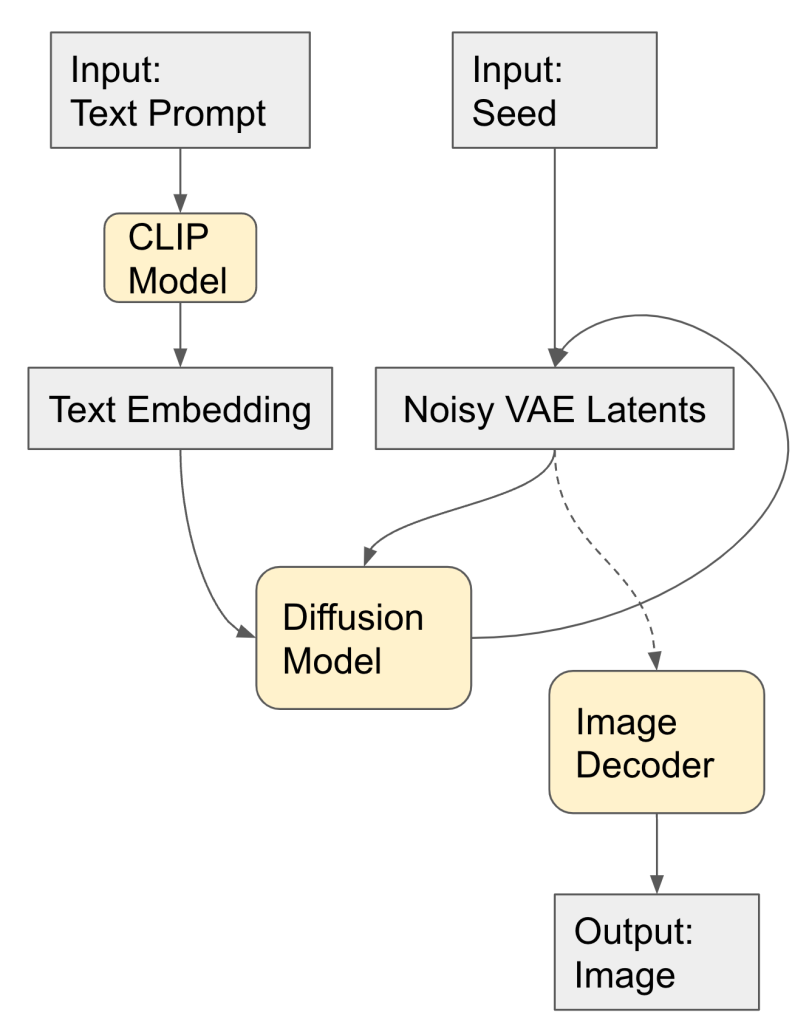
  1. The model takes as inputs a text prompt and a random seed.
  2. These are used to create a text embedding and initial pure-noise VAE latents.
  3. The diffusion algorithm progressively de-noises the VAE latents to obtain a ‘clean’ latent image which matches the text prompt to some extent. (As an aside, at each step new noise is generated and added to the de-noised image; you really need to use the same random generator seed, and not just the same initial noisy VAE latent.)
  4. The VAE decoder (very quickly) converts the de-noised latent image to a full sized output image.
Diagram of Stable Diffusion inputs, embeddings, and sub-models.
The various parts of Stable Diffusion.

So, if you run the same text prompt from the same random seed, you get the same image. Now, it turns out that a small change in the text embedding space mostly corresponds to a small change in the output image. This continuity makes the text embedding space a good playground.

Note that the VAE image latents are actually a pretty boring space, by comparison: the latents have shape [4, 64, 64] where the last dimensions correspond to image height and width. This blog post shows that the VAE latents are actually quite close to the image already. You can get some kind of effects by manipulating the VAE latents (for example, sending x to -x takes the color negative of the image more or less), but these effects aren’t terribly interesting, like degraded versions of what you’d try to do in Photoshop.

Morph Animations

Often you can make relatively small changes in the prompt and (so long as you use the same seed) you’ll bet back a very similar image, with some changes in the details. Then you can make a morph animation by ‘walking’ from one text embedding to the other, generating new images along the way. In the image morph animation, I’ve changed the famous actress’ name only, leaving the rest of the prompt the same, and connected the two with 16 transition frames.

KD, Technopriest, morphing into AB, Technopriest.

Stable Diffusion isn’t great at making random faces (you tend to get mosnters), but tends to get the details /mostly/ right for famous people who show up in the dataset a lot. So, to get a good face, pick a famous name. The text embedding transformation gives a nice way to deal with the casual-deepfake problem, though: most of the ‘intermediate’ faces are still good, so we can create text embeddings for a couple-few people, interpolate, and then choose one which doesn’t look too much like any of the ‘source’ faces.

Here’s another example, interpolating between an abandoned street in a city vs a forest. The basic composition remains the same in both images, but one is full of buildings and neon, and the other is full of trees.

A rainy city which is also a rainy forest.

Generating Variations

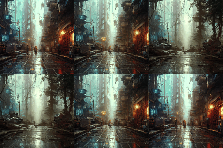
Another neat application of continuity in the text embedding space is that you can use it to explore closely-related images and try to find something sliiightly better than the initial output. You can add noise repeatedly to the base text embedding to get lots of variants, in other words.

AB Technopriest variations.

For this image, I added Gaussian noise to the text prompt with standard deviation 0.02 repeatedly. This was structured as a random walk: each new embedding y[k] = 0.5 * y[0] + 0.5 * (y[k-1] + noise). This can potentially create a nice animation over a longer random walk, as we have some coherency between adjacent steps. The first term (0.5*y[0]) ensures that we stay in the neighborhood of the original image.

Procedural Music in Orca

I recently stumbled on the Orca sequencer, developed by Hundred Rabbits. It bills itself as an ‘esoteric programming language’ for writing music. It is purely a sequencer, and has good integration for MIDI and other output types which I haven’t explored… There are some pretty good tutorials out there already, but I wanted to illustrate a few ‘idioms’ I settled into during a weekend of experimenting with the language. It’s a great language for creating simple home-brew ‘trackers’ for controlling synthesizers.

The thing I’ve always really wanted more of in sequencers is the ability to inject ‘interesting randomness,’ such as varying a note’s gain/velocity randomly, or choosing notes from a given scale at random. SunVOX (my other favorite tracker of the 2010’s) supports random gain, but not much else AFAICT.

In this post, I’ll give a bit of intro/overview of Orca instructions, and document some recipes I came up with for making a slowly mutating bass/melody pattern. Here’s a video of the Orca programming running; it’s controlling my (terribly underutilized) OP-Z.

Continue reading

Turing’s Cathedral, and the Separation of Math and Industry

I’ve just finished reading ‘Turing’s Cathedral,’ an absolutely fascinating book on early computing. The book focuses almost entirely on John von Neumann’s ‘Electronic Computer Project’ carried out at the Institute of Advanced Study in the 40’s and 50’s.  In fact, Turing makes only occasional and brief appearances in the book: it’s almost entirely a portrait of the IAS project, and the wide range of personalities involved.

maniac
John von Neumann and Oppenheimer with the MANIAC computer.

For me, the book emphasized the importance of overcoming (or circumventing) boundaries in the pursuit of scientific progress.  Von Neumann in particular became obsessed with applications (particularly after Godel’s theorem put an end to the Hilbert programme), and served as a bridge between pure and applied mathematics.  Meanwhile, construction of the physical computer brought in a variety of brilliant engineers.  It’s clear that the departmental politics at the IAS were still quite strong – the pure mathematicians didn’t have much regard for the engineers, and the computer project ground to a halt quite senselessly after von Neumann left the IAS.  Dyson argues that Princeton missed an opportunity to be a world center for computing theory and practice as a result.

Continue reading

Space Filling Curves in Simulated Cities

I’ve been playing around with Cities: Skylines recently, the super-popular SimCity knock-off.  Dealing with traffic is a core theme of the game (as it should be).  Traffic tends to accumulate at intersections, and it’s well known that one-way streets have higher traffic flow.  The logical conclusion, then, is to try to build a city with a single extremely long one-way street…  Unfortunately we have to compromise on this perfect vision, because people want to get back home after work and so on.

hilbertville4
Hilbertville: The space-filling city.

A Quick Intro to Space Filling Curves

Meanwhile, a space-filling curve is an mathematical invention of the 19th century, and one of the earlier examples of a fractal.  The basic idea is to define a path that passes through every point of a square, while also being continuous.  This is accomplished by defining a sequence of increasingly twisty paths (H1, H2, H3, …) in such a way that H∞ is well-defined and continuous.  Of course, we don’t want a infinitely twisty road, but the model of the space filling curve will still be useful to us.

There are a few important ideas in the space filling curve.  The first is a notion that by getting certain properties right in the sequence of curves H1, H2, H3, …, we’ll be able to carry those properties on to the limit curve H∞.

moore-curve-stages-0-through-5
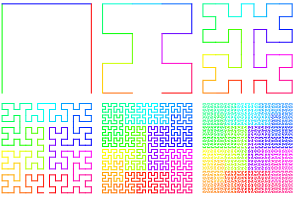
The Moore curve is an example of a (continuous!) space-filling curve.  The color changes keep track of time as you move along the path; notice that in the very twisty sixth path, a small change in time still keeps you in the same (blocky) neighborhood.


The second main idea is how to get continuity.  Thinking of the curve as a function where you’re at the start at time 0 , and you always get to the end at time 1, we want an H∞ where small changes in time produce small changes in position.  The tricky part here is that the path itself gets longer and longer as we try to fill the square, potentially making continuity hard to satisfy…  When the length of the path doubles, you’re moving twice as fast.

In fact, because of continuity, you can also “go backwards:” Given a point in the square, you can approximate what time you would have passed through the point on the limit curve H∞, with arbitrary precision.  This gives direct proof that the curve actually covers the whole square.

Here’s an example of a space filling curve which is not continuous. Define Bk as the curve you get from following these instructions:

  1. Start in the lower-left corner.
  2. Go to the top of the square, and then move right by 1/k.
  3. Move to the bottom of the square, and move right by 1/k.
  4. Repeat steps 2 and 3 until you get to the right side of the square.

The problem here is that a very small change in time might take us all the way from the top of the square to the bottom of the square.  We need to be twistier to make sure that we don’t jump around in the square.  The Moore curve, illustrated above, does his nicely: small changes in time (color) don’t move you from one side of the square to the other.

Actual Simulated Cities

What happens if we try to use space filling curves to build a city in Cities: Skylines?

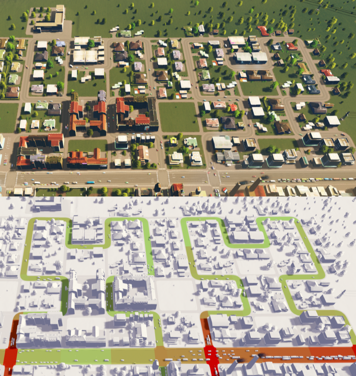
My first attempt at building ‘Hilbertville’ was to make large blocks, with a single, winding one-way road for access, using the design of a (second-order) Hilbert Curve.  In addition to the roads, though, I placed a number of pedestrian walkways, which allow people on foot to get in and out of these neighborhoods directly.  I like to think that this strongly encourages pedestrian transit, though it’s hard to tell what people’s actual overall commuting choices are from the in-game statistics.

hilbertville2
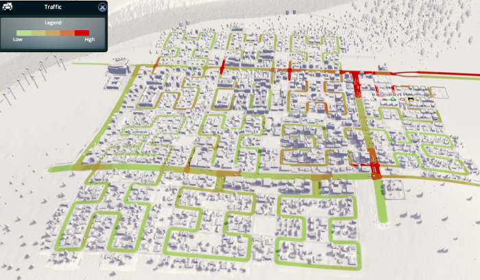
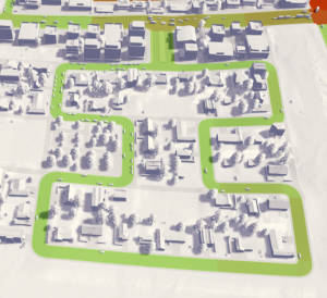
Hilbertville, two blocks. The lower view highlights where the roads are, and are color-coded for the amount of congestion along each segment of roadway. There’s a bit of congestion at the output of each block, as cars wait at the intersections.

Skylines only allows building directly facing a road; corners tend to lead to empty space.  You can see a large empty square in the middle of the two blocks pictured above.  There are also two smaller rectangles and two small empty squares inside of each of these two blocks.  Making the top ‘loop’ a little bit longer removed most of the internal empty space.  This internal space is bad from the game perspective; ideally we would still be able to put a park in the empty spaces to allow people to extra space, but even parks require road access.

Intersections with the main connecting roads end up as ‘sinks’ for all of the traffic congestion.  So we should try to reduce the number of such intersections…  The Moore curve is a slight variation on the Hilbert curve which puts the ‘start’ and ‘finish’ of the path next to one another.  If we merge the start and finish into a wide two-way road, we get this:

hilbertville3
A space-filling road based on the Moore curve.

We still get the wasted square between neighborhoods, but somewhat reduce the amount of empty interior space.  Potentially, we could develop a slightly different pattern and alternate between blocks to eliminate the lost space between blocks.  Also, because the entrance and exit to the block coincide, we get to halve the number of intersections with the main road, which is a big win for traffic congestion.

Here’s a view of the full city; it’s still not super big, with a population of about 25k.  We still get pretty heavy congestion on the main ring road, though the congestion is much less bad than in some earlier cities I built.  In particular, the industrial areas (with lots of truck traffic) do much better with these long and twisty one-way streets.

hilbertville4
Full view of Hilbertville, population 25k. There are fourteen blocks here; note the two Moore curve blocks at the bottom, and the slightly modified Hilbert curve block in the lower left, which reduces empty space at the expense of a slightly longer road.

The empty space is actually caused by all of the turns in the road; fewer corners implies fewer wasted patches of land.  The easiest way to deal with this is to just use a ‘back-and-forth’ one-way road, without all of the fancy twists.

The other major issue with this style of road design is access to services.  Fire trucks in particular have a long way to go to get to the end of a block; the ‘fire danger’ indicators seem to think this is a bad idea.  I’m not sure if it’s actually a problem, though, as the amount of traffic within a block is next to none, allowing pretty quick emergency response in spite of the distance.

Overall, I would say it’s a mixed success.  There’s not a strong reason to favor the twisty space-filling curves over simpler back-and-forth one-way streets, and in either case the access for fire and trash trucks seems to be an issue.  The twistiness of the space-filling curve is mainly used for getting the right amount of locality to ensure continuity in the limit curve; this doesn’t serve a clear purpose in the design of cities, though, and the many turns end up creating difficult-to-access corner spaces.  On the bright side, though, traffic is reduced and pedestrian transit is strongly encouraged by the design of the city.

4D Scatter Plotting

I recently read Edward Tufte’s ‘Visualizing Quantitative Information,’ a classic book on visualizing statistical data.  It reads a little bit like the ‘Elements of Style’ for data visualization: Instead of ‘omit needless words,’ we have ‘maximize data-ink.’  Indeed, the primary goal of the book is to establish some basic design principles, and then show that those principles, creatively applied, can lead to genuinely new modes of representing data.

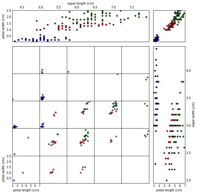
One of my favorite graphics in the book was a scatter plot adapted from a physics paper, mapping four dimensions in a single graphic.  It’s pretty typical to deal with data with much more than three dimensions; I was struck by the relative simplicity with which this scatter plot was able to illustrate four dimensional data.

I hacked out a bit of python code to generate similar images; here’s a 4D scatter plot of the Iris dataset:

scatter4d
4D scatter plot of the Iris dataset

Continue reading

Kaggle Social Networks Competition

front_pageThis week I was surprised to learn that I won the Kaggle Social Networks competition!

This was a bit different from other Kaggle competitions.  Typically, a Kaggle competition will provide a large set of data and want to optimize some particular number (say, turning anonymized personal data into a prediction of yearly medical costs).  The dataset here intrigued me because it’s about learning from and reconstructing graphs, which is a very different kind of problem.  In this post, I’ll discuss my approach and insights on the problem.

Continue reading

Code, Debt, and Bitcoin

frontOnce upon a time in the late nineties, the internet was a crypto-anarchist’s dream.  It was a new trans-national cyberspace, mostly free of the meddling of any kind of government, where information could be exchanged with freedom, anonymity, and (with a bit of work) security.   For a certain strain of crypto-anarchist, Temporary Autonomous Zone was a guiding document, advocating small anarchist societies in the blank spaces of existing society temporarily beyond the reach of government surveillance or regulation.  This was a great idea with some obvious drawbacks: On the one hand, TAZ served as a direct inspiration for Burning Man.  On the other hand, it eventually came out that Peter Lamborn Wilson (who authored TAZ under the pseudonym Hakim Bey) was an advocate of pedophilia, which had clear implications as to why he wanted freedom from regulation.  It’s a document whose history highlights the simultaneous boundless possibilities and severe drawbacks of anarchism.

Against this background, Lawrence Lessig’s Code made the case that the internet TAZ was in fact temporary.   Lessig argued that the internet’s behaviour is determined by a combination of computer code and legal code, and that while the legal code hadn’t been written yet, it would be soon.  His prediction (which has largely been realized) was that the internet would lose its anarchic character through government regulation mixed with a need for security and convenience in commercial transactions. (In addition to these forces, social media also came along, in which people largely sacrificed their anonymity willingly for the convenience of being able to easily communicate with their meatspace social networks.)

In thinking about Bitcoin, it’s useful to see how the regulation came to change the internet.  The prediction (again pretty much correct) was that regulations would target large companies instead of individual users.  Companies are compelled to follow the law under the ultimate threat of not being allowed to operate at all.  Because of the tendency for people to glom onto just a few instances of working solutions, it becomes easy to target a few large entities to enact regulation on a broad base of users.

Continue reading

Driverless Futures

Google unveiled it’s newest iteration of the driverless car, this time without a steering wheel or brake pedals.  It looks a bit like a smart car crossed with a Beetle and a koala, but I’m still pretty excited about it.

early-vehicle-lores

I have never bothered to get a driver’s license, and it seems now like I was a (relatively) early-adopter of car-free life instead of a life-long freak: the proportion of young people with licenses has been steadily declining over the last ten years.  When I was 16, I looked around and saw lots of teenagers getting crappy cars to drive to crappy jobs to pay for their crappy cars, and decided that I didn’t really want to be involved in that cycle.  Spending 15-30 hours working at Dairy Queen didn’t seem like a terribly valuable experience.

Continue reading

Winter on Georgian Bay

Back in late December, I planted a Raspberry Pi camera at a cottage on Georgian Bay, in Northern Ontario, set to take a picture once every two minutes.  I had been planning the shoot for a couple months prior to the deployment: There were two Raspberry Pi’s involved, in case one failed somewhere during the winter.  One of the Pi’s was set to reboot once a week, just in case the software crashed but the Pi was still awake.  I had also written some software for the time-lapse to ensure that pictures were only taken during the day time, and to try to maintain a balance of well-lit, consistent images over the course of each day.

In spite of all the planning, I had a sense that something would go horribly wrong, and, indeed, when we showed up to the cottage, the windows were completely frosted over.  The cameras had to be placed inside, so we figured we would mainly see the back-side of an icy window when we retrieved the cameras.  Or that the camera boards would literally freeze after about a week of sub-zero temperatures in the unheated cottage.  Or that a raccoon would find it way in and gnaw through the shiny Lego cases.  Or something else entirely unplanned for.

So it was a bit of a surprise when it turned out that the shoot went perfectly.  We retrieved the cameras about a week ago, on May 7th, and found over 42,000 photos waiting for us on one of the cameras and somewhat fewer on the other.  Both cameras had survived the winter just fine!

All told, I think the result was really cool!  The video at the top is the ‘highlights’ reel, with all of the best days.  It comes to 13 minutes at 18 frames per second.  Turns out it was a fantastic winter for doing a time-lapse, with lots of snow storms and ice.  There’s even the occasional bit of wildlife, if you watch closely.  I’ll post the full 40-minute time-lapse on Youtube sometime next week.

Continue reading