4D Scatter Plotting

I recently read Edward Tufte’s ‘Visualizing Quantitative Information,’ a classic book on visualizing statistical data.  It reads a little bit like the ‘Elements of Style’ for data visualization: Instead of ‘omit needless words,’ we have ‘maximize data-ink.’  Indeed, the primary goal of the book is to establish some basic design principles, and then show that those principles, creatively applied, can lead to genuinely new modes of representing data.

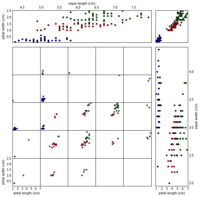
One of my favorite graphics in the book was a scatter plot adapted from a physics paper, mapping four dimensions in a single graphic.  It’s pretty typical to deal with data with much more than three dimensions; I was struck by the relative simplicity with which this scatter plot was able to illustrate four dimensional data.

I hacked out a bit of python code to generate similar images; here’s a 4D scatter plot of the Iris dataset:

scatter4d
4D scatter plot of the Iris dataset

Continue reading

Machine Learning Resources for Mathematicians

What it feels like to wade into a new field.

I met up with some mathematician friends in Toronto yesterday, who were interested in how one goes about getting started on machine learning and data science and such.  There’s piles of great resources out there, of course, but it’s probably worthwhile to write a bit about how I got started, and place some resources that might be of more interest to people coming from a similar background.  So here goes.
First off, it’s important to understand that machine learning is a gigantic field, with contributions coming from computer science, statistics, and occasionally even mathematics…  But on the bright side, most of the algorithms really aren’t that complicated, and indeed they can’t be if they’re going to run at scale.  Overall though, you’ll need to learn some coding, algorithms, and theory.

Oh, and you need to do side-projects.  Get your hands dirty with a problem quickly, because it’s the fastest way to actually learn.

Continue reading

Principal Component Analysis via Similarity

PCA illustration from Wikipedia.

Recently I’ve seen a couple nice ‘visual’ explanations of principal component analysis (PCA).  The basic idea of PCA is to choose a set of coordinates for describing your data where the coordinate axes point in the directions of maximum variance, dropping coordinates where there isn’t as much variance.  So if your data is arranged in a roughly oval shape, the first principal component will lie along the oval’s long axis.

My goal with this post is to look a bit at the derivation of PCA, with an eye towards building intuition for what the mathematics is doing.

Continue reading