I recently read Edward Tufte’s ‘Visualizing Quantitative Information,’ a classic book on visualizing statistical data. It reads a little bit like the ‘Elements of Style’ for data visualization: Instead of ‘omit needless words,’ we have ‘maximize data-ink.’ Indeed, the primary goal of the book is to establish some basic design principles, and then show that those principles, creatively applied, can lead to genuinely new modes of representing data.
One of my favorite graphics in the book was a scatter plot adapted from a physics paper, mapping four dimensions in a single graphic. It’s pretty typical to deal with data with much more than three dimensions; I was struck by the relative simplicity with which this scatter plot was able to illustrate four dimensional data.
I hacked out a bit of python code to generate similar images; here’s a 4D scatter plot of the Iris dataset:
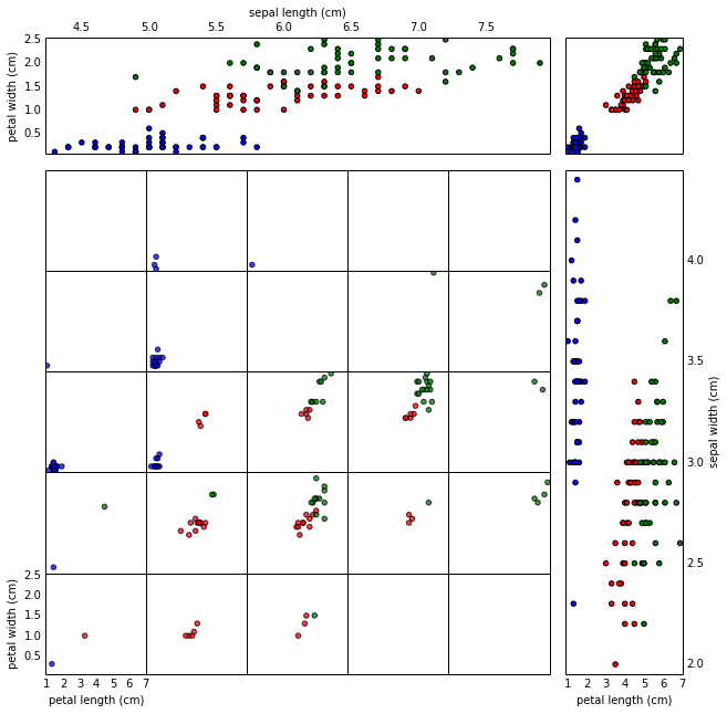
The Iris dataset consists of measurements of three species of iris flowers: Iris Setosa (red), Iris Virginica (green), and Iris Versicolor (blue). For each flower, four measurements are taken: petal length, petal width, sepal length, and sepal width. (It turns out the sepal length is the length of the small leaves just behind/between the petals, the remnants of the bulb that bloomed into the flower.) The data was published in 1936, by a RA Fisher, who was interested in using higher-dimensional data in classification: Fisher’s paper was titled “The Use of Multiple Measurements in Taxonomic Problems.” And ever since, it’s been a standard data set for testing statistical classification techniques, as well as schemes for high-dimensional plotting. (It’s pretty tiny by modern standards, though.)
In the main grid of the 4D scatter plot, each of plots shows petal length vs petal width, for a range of sepal lengths and sepal widths. As one moves through the scatter plots to the right, the sepal lengths represented in the scatter plots increase; you can think of a row of scatter plots as frames in an animation where the sepal length is acting as ‘time.’ Likewise, as one moves up through the plots, sepal width increases.
On the top and right side, there are marginal plots of sepal length vs petal width (top), and sepal width vs petal length (right). Note that the divisions of the smaller scatter plots give the binning of sepal length and width: notice that there’s only one blue dot in the middle column of the scatter matrix, corresponding to the right-most dot in the marginal plot at the top.
Finally, the upper-right gives space for one more plot, which I’ve used for an overall marginal plot illustrating just petal length vs petal width.
Scatter plots can use a few other tricks for packing in a bit more data: point size, transparency, and color add a bit more data, but are usually useful mostly for comparison of points, and can be impossible to read if over-thought. I tend to think of each of these as a half-dimension: Color in particular tends to fail if used for more than a few discrete labels, or if more complicated than a simple two-color gradient.
The better-known multi-dimensional scatter plot is the scatter matrix, which has one scatter plot for each pair of variables. Here’s an example scatter matrix, for comparison:
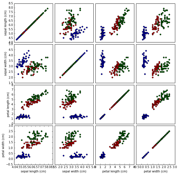
It’s advantage is that one can have any number of variables (not just four), but one loses the sense of how pairs of variables change as a third variable changes. The plots on the diagonal show the single-variable distributions; this feels a bit like wasted space, though in this case we see that petal characteristics on their own make it very easy to separate the versicolor irises.
